Part 2 – The Experience Profile App
Sitecore’s Experience Profile shows a detailed breakdown of each Contact (visitor of the site) and is built using Sitecore’s SPEAK, so to modify the app it we are going need to use the Sitecore Rocks Visual Studio Extension. To refresh, here is an overview of what we’re trying to achieve.
We’re going to create a new Tab on the Experience Profile App for our Interaction Facet we built previously, the Tab will show the actions the User has completed on the site which are unique to the client. Within that Tab we have a collection of Sub Tabs, one for each Element of the Facet, e.g. Sample Orders, Videos Played etc. Then each Sub Tab has a Panel to display the data.
Helpful hint before we start
If you’re not familiar with SPEAK I recommend you look at / copy the existing Activity Tab then rename and relink the items as I describe below. It’s similar to what we are aiming for. Plus, it’s also a useful comparison for troubleshooting.
Creating a custom Experience Profile tab
In Sitecore Rocks connect to the Core database, Sitecore’s own apps are created from Sitecore Items in the Core. Navigate to the Experience Profile App, typically located at the path /sitecore/client/Applications/ExperienceProfile. We are interested in creating a new Tab on the Contact details Page, so navigate to the Tabs folder /sitecore/client/Applications/ExperienceProfile/Contact/PageSettings/Tabs.
Add a new Item to this folder based on the Tab Template, giving it a descriptive Name, ‘Interactions’ in this example. This is our custom tab, everything we create will be displayed when this tab is selected.
Under that Item create another based on the same template to act as the Panel which is displayed when clicking that tab, call it ‘InteractionsPanel’. Finally create a folder under the ‘Interactions’ Tab Item to hold all the Sub Tabs called ‘Interactions SubTabs’.
We want our new tab to look similar to the out-of-the-box ones so on the ‘Interaction’ Tab Item add the following renderings to the Layout – note the Id, Placeholder and Data Source properties:
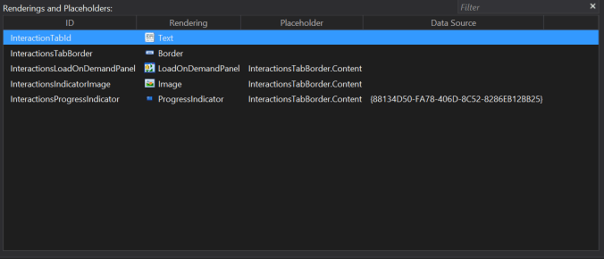
- Text rendering displays the text on the Tab by the Text property set to this Item’s Id.
- Border rendering adds a Border and Placeholder for other renderings to be added to this Interactions Tab.
- LoadOnDemandPanel loads an Item that acts as a Panel to hold the Sub Tabs. Set the LoadOnDemandPanel rendering’s ItemId property to this Item’s (‘Interaction’ Tab Item) Id.
- Image the image that is used for the loading icon
- ProgressIndicator show the loading indicators as the JavaScript executes. Datasourced to a default ProgressIndicator Item – {88134D50-FA78-406D-8C52-8286EB12BB25}.
For the ‘InteractionPanel’ Item, acting as the content of the Tab we just created, the Layout has the following Renderings;

- SubPageCode is the JavaScript page code for this tab, this is covered shortly.
- Border rendering is used for a Placeholder of the following TabControl.
- TabControl rendering will hold the various Tabs for the Elements in the Interaction Facet i.e. Samples Ordered, Videos Watched etc. The rendering’s TabType property set to ‘SubTab’ so it is separate from the preexisting tabs. The Data Source property set to the folder we created earlier for the Sub Tabs.
The SubPageCode references a custom JavaScript file via the PageCodeScriptFileName property. We need to write a JavaScript to retrieve the SubTabs from the TabControl rendering, display them and when clicking on each that SubTab’s panel displays.
This file contains hidden or bidirectional Unicode text that may be interpreted or compiled differently than what appears below. To review, open the file in an editor that reveals hidden Unicode characters.
Learn more about bidirectional Unicode characters
| define(["sitecore", "/-/speak/v1/experienceprofile/CintelUtl.js"], function (sc, cintelUtil) { | |
| var selectedTabProperty = "selectedTab"; | |
| var textProperty = "text"; | |
| var app = sc.Definitions.App.extend({ | |
| initialized: function () { | |
| this.processTabs(); | |
| }, | |
| loadPanel: function () { | |
| var panelId = $("[data-sc-id='InteractionsTabControl'] > .tab-content > .active .sc-load-on-demand-panel").data("sc-id"); | |
| var panel = this[panelId]; | |
| if (panel && !panel.get("isLoaded")) { | |
| panel.on("change:isLoaded", function () { | |
| panel.set("isBusy", false); | |
| }); | |
| panel.set("isBusy", true); | |
| panel.load(); | |
| } | |
| }, | |
| showDefaultTab: function () { | |
| var firstTabId = this.InteractionsTabControl.get(selectedTabProperty); | |
| var urlTabId = this.getTabIdFromUrl(); | |
| if (urlTabId && urlTabId != firstTabId) { | |
| this.InteractionsTabControl.set(selectedTabProperty, urlTabId); | |
| } else { | |
| this.loadPanel(); | |
| } | |
| }, | |
| processTabs: function () { | |
| this.InteractionsTabControl.on("change:" + selectedTabProperty, function (tabControl, selectedTab) { | |
| this.loadPanel(); | |
| }, this); | |
| this.showDefaultTab(); | |
| }, | |
| getTabIdFromUrl: function () { | |
| var tabName = cintelUtil.getQueryParam("subtab"); | |
| if (!tabName) return null; | |
| var tabIdControlId = tabName[0].toUpperCase() + tabName.toLowerCase().substring(1) + "TabId"; | |
| var tabIdControl = this[tabIdControlId]; | |
| if (!tabIdControl) return null; | |
| return tabIdControl.get(textProperty); | |
| } | |
| }); | |
| return app; | |
| }); |
Okay so this is what we have achieved so far (I added five SubTab items to help visualise)

Creating a custom ListControl in Experience Profile
Under our SubTabs folder we’ll need to create a number of items for the Tabs, the Lists and the Columns of the list. We repeat this for every type of data we want to show. In this example I’ll create a ListControl to show data from an xDB Facet; a list of product samples ordered by this Contact.
Under the ‘Sub Tabs ‘folder add an Item using the Tab Template name it after the Element that holds the data in xDB, e.g. ‘SampleOrders’. Beneath this add the following Items. The first, ‘SampleOrderPanel ‘to hold the contents of the Tab and use the Tab Template. The second based on the AdvancedExpander Parameters Template titled ‘SampleOrdersAccordion’, I’ll explain its purpose shortly.
Add yet another new Item, this time beneath the ‘SampleOrderPanel’, a ListControl Template Item which will list the data, named ‘SampleOrders’. Below ListControl create a new an Item for each property of the data we want to show. In this example I want to show the Range Code and Decor Code of the sample ordered so the two Items will use the ColumnField Template. For each of those ColumnField Items set the DataField field to be the name of the xDB Attribute its to show e.g. ‘RangeCode’ and ‘DecorCode’ respectfully and make sure the Is Active field on those Items is set to true.
Note – Even though we want to order the ListControl data, we aren’t required to add those columns such as a datetime stamp.

Overview of the structure
The ‘SampleOrders’ Tab item will have the same renderings as the first ‘Interactions’ Item we created. Which makes sense as its just a tab which retrieves the content of the tab from another Item via the LoadOnDemandPanel.
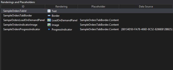
- Text rendering Text property set to this Item’s Id.
- Border rendering adds a Border and Placeholdeb
- LoadOnDemandPanel set the ItemId property to this Item’s (‘SampleOrders’ Tab Item) Id.
- Image for the loading icon
- ProgressIndicator Datasourced to a default ProgressIndicator Item again.
Okay, to get the ListControl displaying custom data. The renderings of the ‘SampleOrdersPanel’ Item are as follows:
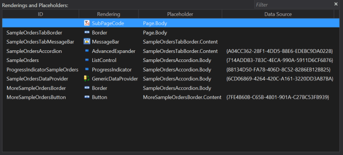
- SubPageCode rendering which I’ll cover shortly
- The Border rendering adds a Placeholder for the other renderings.
- The MessageBar is used to display messages, as you would have guessed, its helpful as it also shows exception messages.
- AdvancedExpander datasources the ‘SampleOrdersAccordion’ Item we created earlier. The next four renderings are added to this AdvancedExpander‘s placeholder.
- The ListControl is responsible for displaying the data
- Set the Datasource the SampleOrders ListControl item
- Items field looks at the data provider to know what to display e.g. {Binding SampleOrdersDataProvider.cidata}.
- ProgressIndicator displays a loading indicator for the ListControl
- Set it’s Target property to the Id of the ListControl
- IsBusy property is wired to the following GenericDataProvider e.g. {Binding SampleOrdersDataProvider.IsBusy}
- Finally it datasourced to the out-of-the-box ProgressIndicator Item.
- GenericDataProvider actually holds the data we are loading and displaying. Datasourced to an Item called DataProviderForListControl – {6CD06869-4264-420C-A161-3220DD3AB7BA}
- Border adds a placeholder for a ‘see more’ button is more data is available than the page size.
- To set this conditional visibility set the IsVisible field to a property of the DataProvider denoting if there is more data available than the page – {Binding SampleOrdersDataProvider.HasMoreData}
- The Button facilitates pagination of the data, its Click event field set to a preexisting JavaScript Method – javascript:app.SampleOrdersDataProvider.nextListData().
Finally for the SubPageCode rendering. It references a custom JavaScript file that effectively wires up all the Renderings we’ve added, retrieve all the data from xDB from the Pipelines we created in the previous blog and passes it to the DataProvider.
This file contains hidden or bidirectional Unicode text that may be interpreted or compiled differently than what appears below. To review, open the file in an editor that reveals hidden Unicode characters.
Learn more about bidirectional Unicode characters
| define(["sitecore", "/-/speak/v1/experienceprofile/DataProviderHelper.js"], function (sc, providerHelper) | |
| { | |
| var app = sc.Definitions.App.extend({ | |
| initialized: function () | |
| { | |
| var tableName = "sampleorders"; // Case Sensitive! | |
| var localUrl = "/intel/" + tableName; | |
| providerHelper.setupHeaders([ | |
| { urlKey: localUrl + "?", headerValue: tableName } | |
| ]); | |
| var url = sc.Contact.baseUrl + localUrl; | |
| providerHelper.initProvider(this.SampleOrdersDataProvider, tableName, url, this.SampleOrdersTabMessageBar); | |
| providerHelper.subscribeSorting(this.SampleOrdersDataProvider, this.SampleOrders); | |
| providerHelper.getListData(this.SampleOrdersDataProvider); | |
| providerHelper.subscribeAccordionHeader(this.SampleOrdersDataProvider, this.SampleOrdersAccordion); | |
| sc.Contact.subscribeVisitDialog(this.SampleOrders); | |
| } | |
| }); | |
| return app; | |
| }); |
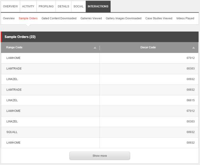
And finally, this is what we have achieved
Helpful hints
To help debugging etc you can access the data you are trying to display via Web API, it exists in the following format – <hostname>/sitecore/api/ao/v1/contacts/<id of the contact>/intel/<element name>. In my case I would use the following Url to view the sample orders of an Contact – jonathanrobbins/sitecore/api/ao/v1/contacts/bbf12b9f-876e-41eb-b3d7-bccd602d4886/intel/sampleorders.
If you are seeing the following error
Javascript -
Ensure that the text AND casing of the tableName variable in the SubPageCode of the ListView Item matches the exact name you gave to the matching ExperienceProfileContactViews pipeline. E.g. ‘sampleorders’
This file contains hidden or bidirectional Unicode text that may be interpreted or compiled differently than what appears below. To review, open the file in an editor that reveals hidden Unicode characters.
Learn more about bidirectional Unicode characters
| <configuration xmlns:patch="http://www.sitecore.net/xmlconfig/"> | |
| <sitecore> | |
| <pipelines> | |
| <group groupName="ExperienceProfileContactViews"> | |
| <pipelines> | |
| <sampleorders> | |
| <processor type="ISlayTitans.CMS.Pipelines.ContactFacets.Reporting.SampleOrders.ConstructSampleOrdersDataTable, ISlayTitans.CMS" /> | |
| <processor type="Sitecore.Cintel.Reporting.Processors.ExecuteReportingServerDatasourceQuery, Sitecore.Cintel"> | |
| <param desc="queryName">sampleorders-query</param> | |
| </processor> | |
| <processor type="ISlayTitans.CMS.Pipelines.ContactFacets.Reporting.SampleOrders.PopulateSampleOrdersWithXdbData, ISlayTitans.CMS" /> | |
| <processor type="Sitecore.Cintel.Reporting.Processors.ApplySorting, Sitecore.Cintel"/> | |
| <processor type="Sitecore.Cintel.Reporting.Processors.ApplyPaging, Sitecore.Cintel"/> | |
| </sampleorders> | |
| </pipelines> | |
| </group> | |
| </pipelines> | |
| </sitecore> | |
| </configuration> |
The Items you are creating in SPEAK have various different Fields you can use to control the text appearing in the Tab, the headers of the column of the ListControl. As I mentioned have a look at the existing Activities Tab to get an idea what controls what.
And that’s it!
That is how you store custom data in xDB, create pipelines to pull out the various Elements and Attributes and then display each in the Experience Profile. This tutorial covers one Element so you will need to repeat the steps for each Element you want to display.
I’d recommend you separate your custom Facets both from each other and the preexisting ones. Save headaches when it comes to upgrading Sitecore, changes to your own data etc.
There is so much to talk about on this topic, things I’ve done but not covered here. For example showing data that isn’t a list. So I’ll likely keep posting to hopefully help you out.
 Exercising Sitecore
Pingback: Extending Sitecore Experience Profile in Sitecore 9 – Konabos Consulting Inc.
Pingback: Sitecore 8 – Extending Experience Profile – Part 2 – Displaying Contact Facet Simple Properties – Rey Rahadian